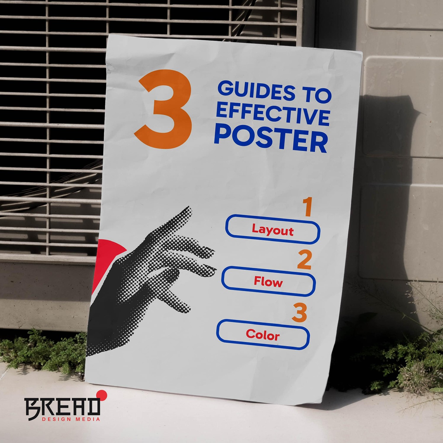
A Guide to Effective Posters & Advertisements: Layout, Flow, and Color.
Published: Tags: AdvertisementTo truly capture attention and communicate your message, you need to carefully consider three key elements: layout, flow, and color. Let’s break down how each of these contributes to a powerful ad.
1. Layout: Structure Is Key
The layout of your poster or advertisement refers to how the various elements—text, images, logos, and call-to-actions—are arranged on the page. A good layout is balanced and uncluttered, ensuring that your message is easy to understand at a glance.
- Use a hierarchy: Prioritize the most important information, such as the headline or product image, and place it in a prominent position. Supporting details can be arranged around it.
- Maintain white space: Don’t overcrowd your poster with too much information. White space (empty areas) around elements helps to make the content more digestible and visually appealing.
- Follow the rule of thirds: Divide the poster into a 3x3 grid and position key elements along the lines or intersections for a balanced and aesthetically pleasing design.
2. Flow: Guiding the Viewer’s Eye
Flow refers to how a viewer’s eye moves across your advertisement. Effective flow ensures that the audience sees the most important elements first and follows a logical path through the information.
- Focal points: Start with a strong focal point, like an attention-grabbing image or headline, and design the layout so that the viewer naturally moves from one element to the next.
- Use lines and shapes: Lines, arrows, or even the direction in which a person in a photo is looking can subtly guide the viewer’s attention.
- Z-pattern layout: Many people read left to right in a Z-shaped pattern, scanning from the top-left corner to the bottom-right. Position key elements along this path to make sure they’re seen in the right order.
3. Color: More Than Just Aesthetic
Color isn’t just about making your poster look attractive—it plays a huge role in evoking emotions and setting the tone of your message. Choosing the right colors can make or break the effectiveness of your ad.
- Brand consistency: Use colors that align with your brand identity. This helps with recognition and reinforces your brand message.
- Contrast for readability: Make sure there’s enough contrast between your background and text to ensure that the content is easy to read. Dark text on a light background (or vice versa) works best.
- Evoke emotions: Colors have psychological associations. For example, red can evoke excitement or urgency, while blue tends to convey trust and calm. Choose colors based on the mood or message you want to convey.
Conclusion
When creating posters or advertisements, a thoughtful approach to layout, flow, and color can make all the difference between a design that grabs attention and one that gets overlooked. A well-structured layout, logical flow, and the right color palette will help ensure that your message stands out and resonates with your audience.